There was a time when most of the web designers used to rely on web safe font’s like Times Roman, Arial, Helvetica and Verdana. These are great fonts but times have changed and the modern websites and blogs need fonts that not only break the monotony of Arial and Times Roman, but also they should look beautiful and must be easy to read on screens of various sizes. To help your quest for the best font for your website, we have done some research. This article contains a compilation of best fonts for websites.
Fonts do matter a lot and it is important to carefully select a perfect font for your website. A good choice of fonts will do wonders to your website both in terms of aesthetics as well as usability. Today there are thousands of web safe fonts are available on Internet. Let’s learn about top 10 of best fonts.
What are Web Safe Fonts?
A decade ago, web browsers were able to show only those fonts that were installed on visitor’s computer. Because most of the users used Windows based computer and fonts like Arial and Times Roman came pre-installed, it was considered safe to use these fonts in web pages. Use of web safe fonts ensured that your website would show text in a font that was intended.
Earlier, if a web designer wanted to use some fancy, “unsafe” font, there were methods to do so. But those methods were either unreliable or they slowed down the website loading speed. But gone are those days. Now there are services that easily provide you great fonts from a vast cache. And in most cases, these fonts are free, fast loading and reliable.

Best Fonts for Websites
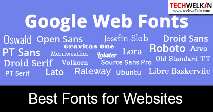
Google Fonts is a very useful font library of fancy fonts where from you can get hundreds of fonts. At present the total number of fonts available in Google Fonts exceeds 800. To save you time, we have selected the following fonts that we believe are best fonts for websites. Most of these fonts are available from Google Fonts. If a font is not available in Google Fonts, we have given the source where from you can acquire that font:
- Best Fonts for Website
- Open Sans
- Vollkorn
- Lato
- Josefin Slab
- Droid Sans
- Old Standard TT
- Roboto
- Ubuntu
- Museo Slab
- Lobster
- Myriad
Open Sans
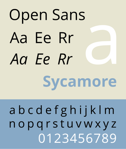
Open Sans is a sans-serif typeface designed by Steve Matteson and commissioned by Google. According to Google, it was developed with an “upright stress, open forms and a neutral, yet friendly appearance” and is “optimized for legibility across print, web, and mobile interfaces.” Featuring wide apertures on many letters and a large x-height (tall lower-case letters), the typeface is highly legible on screen and at small sizes. It belongs to the humanist genre of sans-serif typefaces, with a true italic. [Source: Wikipedia]

Vollkorn
Friedrich Althausen, designer of this font says:
Vollkorn came into being as my first type designing attempt. I published the Regular in 2005 under a Creative-Commons-License. Until the counter finally collapsed two years later it had been downloaded thousands of times and used for web and print matters. It intends to be a quiet, modest and well working text face for bread and butter use. Unlike its examples in the book faces from the renaissance until today, it has dark and meaty serifs and a bouncing and healthy look. It might be used as body type as well as for headlines or titles. »Vollkorn« (pronounced »Follkorn«) is German for »wholemeal« which refers to the old term »Brotschrift«. It stood for the small fonts for every day use in hand setting times. [Source: Google Fonts]
Lato
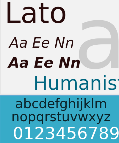
Lato is a sanserif typeface family designed in the Summer 2010 by Warsaw-based designer Łukasz Dziedzic (“Lato” means “Summer” in Polish). In December 2010 the Lato family was published under the open-source Open Font License by his foundry tyPoland, with support from Google. [Source Lato Fonts]

Josefin Slab
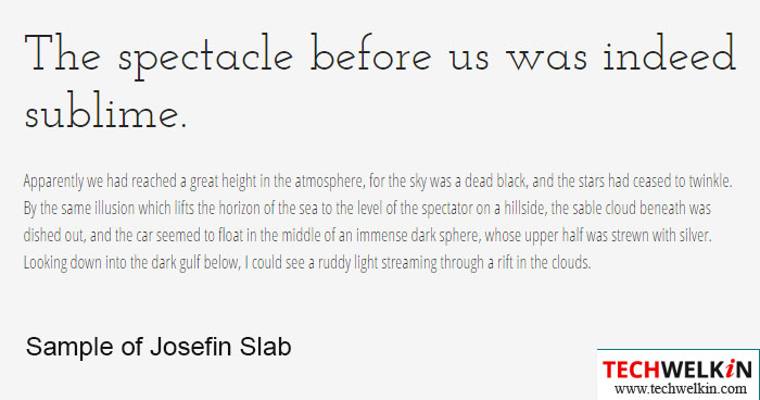
Designer Santiago Orozco describes this beautiful font as: I wanted to stick to the idea of Scandinavian style, so I put a lot of attention to the diacritics, especially to “æ” which has loops connecting in a continuous way, so the “e” slope was determined by this character. It also has some typewriter style attributes, because I’ve liked the Letter Gothic typeface since I was in high school, and that’s why I decided to make a Slab version of Josefin Sans. [Source Google Fonts]

Droid Sans
Droid Sans looks more or less same as Open Sans. Droid font family was first released in 2007 and created by Ascender Corporation for use by the Open Handset Alliance platform Android and licensed under the Apache License. The fonts are intended for use on the small screens of mobile handsets and were designed by Steve Matteson of Ascender Corporation. The name was derived from the Open Handset Alliance platform named Android. [Source: Wikipedia]
Old Standard TT
Old Standard reproduces a specific type of Modern (classicist) style of serif typefaces, very commonly used in various editions of the late 19th and early 20th century, but almost completely abandoned later. However, this lettertype still has at least two advantages:
- it can be considered a good choice for typesetting scientific papers, especially on social and humanitarian sciences, as its specific features are closely associated in people’s eyes with old books they learned on;
- the most beautiful examples of Greek and Cyrillic lettertypes were all based on the classicist style, so for those scripts, “Modern” fonts are much more appropriate than any contemporary (e. g. Times-based) designs. [Source: Google Fonts]
Roboto
Although Robots was designed by Google for its Android mobile operating system, we love this font for websites as well. Google describes the font as “modern, yet approachable” and “emotional”. The entire font family has been licensed under the Apache license and was officially made available for free download on January 12, 2012, on the newly launched Android Design website. It belongs to the neo-grotesque genre of sans-serif typefaces, and includes Thin, Light, Regular, Medium, Bold and Black weights with matching oblique styles. It also includes condensed styles in Light, Regular and Bold, also with matching oblique designs. [Source: Wikipedia]
Ubuntu
This excellent font has been designed by Dalton Maag. It is available on Google Fonts. Both the final font Truetype/OpenType files and the design files used to produce the font family are distributed under an open licence and you are expressly encouraged to experiment, modify, share and improve.
The new Ubuntu Font Family was started to enable the personality of Ubuntu to be seen and felt in every menu, button and dialog. The typeface is sans-serif, uses OpenType features and is manually hinted for clarity on desktop and mobile computing screens.
The scope of the Ubuntu Font Family includes all the languages used by the various Ubuntu users around the world in tune with Ubuntu’s philosophy which states that every user should be able to use their software in the language of their choice. So the Ubuntu Font Family project will be extended to cover many more written languages. [Source: Google Fonts]
Museo Slab
Museo Slab is a sleek and wide-ish serif font. Museo Slab is robust slab serif with Museo’s friendliness. Designed by Jos Buivenga, the Museo Slab font family is a perfect match for Museo Sans. The Story of Museo Sans in Jos Buivenga’s words:
When Museo became a success I researched some possibilities of other versions. Museo Sans was not that difficult because making a sans out of a (semi) serif is —more or less— cutting off the serifs and adjusting weight, width and contrast. So… I made Museo Sans and while doodling around and fiddling with slab serifs to make Museo Slab I discovered something nice I used to design Calluna1 first. Of course that escapade had a reason. I couldn’t find the right solutions to all Museo Slab’s design hurdles. About one year later —after a radio interview with Aaron and Matt from RBtL2— my interest in Museo Slab got fired up again. Don’t know why, but this time I got it all working.
This font goes very well with Museo Sans and can be downloaded from Fonts.com
Lobster
The Lobster font took a different approach. The new OpenType format gives us the possibility to have multiple versions of each letter, and that’s exactly what we are doing: Instead of compromising the design of our letters to force connections, we do what lettering artist do. We draw many versions of each letter and a lot of different letter-pairs (aka “ligatures”) so we always use the best possible variation of each letter depending of the context of the letter inside each word. All this happens automatically in any browser that supports ligatures. [Source: Google Fonts]
Myriad
Released in 1992, the Myriad® typeface family has become a popular choice for both text and display composition. Since it was made available in a Pro character set in the OpenType® format, Myriad’s considerable reach was increased though the addition of Greek and Cyrillic glyphs, as well as old style figures. The Myriad family includes condensed, normal and extended widths in a full range of weights. Well-drawn letter proportions, clean, open shapes and extensive kerning pairs ensure that the design retains a comfortable level of readability across all of its variants. [Source: Fonts.com]
So, that was our list of best fonts for websites. If you’re a website owner and are planning to redesign your website, we highly recommend that you consider these fonts. Stay connected with us. Thank you for using TechWelkin!

Leave a Reply